Gap’s Million-Dollar Rebrand Lasted 6 Days
A timely lesson: If it ain't broke, don't fix it
Back in 2010, Gap almost committed brand suicide with an untimely — and unnecessary — redesign, which cost the company millions of dollars and lasted a grand total of six days.
Between 1980 and early 2000s, Gap set the tone in retail. Everyone wore their blue jeans and t-shirts. Their list of celebrity endorsements was endless: Kirsten Dunst, Chris Evans, John Mayer, and Madonna, to name a few. They had over 3,000 stores in over 40 countries, and even Will Ferrell got on board to sing about how their jeans were his first love. Those were the days.
Today, Gap is a shadow of its former self. In 2019, it spun off one of its more successful acquisitions, Old Navy, before posting its first sales decline in three years. In November of that year, Gap Inc’s CEO, Art Peck, stood down, and shares immediately fell 10%. The decline of the brand has proved very costly to the founding family, the Fishers, who have seen their wealth decline by $1 billion as their shares continue to lose value.
Though its future is uncertain, it almost brought itself to an abrupt end in 2010, through one of the worst received rebrands in history.
The Rebrand
In 2010, Gap was facing a decline in sales in the aftermath of the financial crash of 2008. Gap’s stock price dropped more than 40%, and something had to be done.
The board believed the answer to their woes was to rebrand, and the company decided it was time to change its logo.
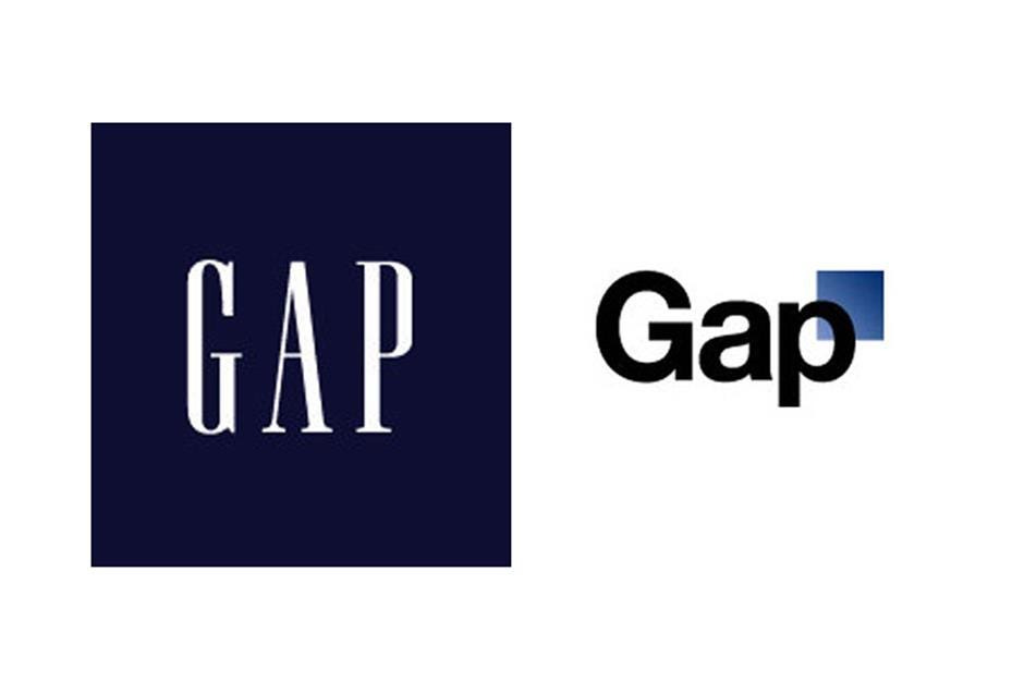
During the busiest time in the retail calendar, Christmas season, of course, Gap did the unthinkable and launched a shiny new brand, with literally no warning to their customers.
But, rather than fully relaunch the company, this was the extent of the “reboot.” Its various stores remained the way they were before, still good ol’ brick and mortar, the same clothing rails with different styles of items on it. There was no launch of new lines to accompany this new direction.
The problem was, there wasn’t a new direction. They didn’t even bother to tell their millions of customers why they did it. (Read: there was no reason. Gap simply believed that its logo had grown so old and frail, that it needed to be swapped out for a fresher, more youthful specimen— and that this would solve its lowering sales.)
It was just a random, unannounced logo, for the sake of being a new logo.
As Barry Enderwick, former director of marketing at Netflix, put it: “Rather than make a strategic shift followed by a signal to consumers, they signaled first. Which only served to confuse consumers. People saw the same website, same stores with the same merchandise but with a new logo. It didn’t make any sense, and the resulting backlash was instant, as well as intense.”
The biggest problem was that the logo was total rubbish. Absolute design stink 101. Hell, they chose to use Helvetica as the main font. In 2010. The result looked like a high school kid’s first attempt at designing on Microsoft word.
And the world took notice almost instantly.
The Rebrand, Ridiculed
The outcry was swift, and cutthroat, especially among the design community.
Armin Vit, a designer, noted: “The new logo is completely embarrassing, and it’s hard to understand how the client and design firm arrived at this decision.”
Jason Santa Maria, creative director for Typekit, said: “Any designer, especially logo designer, worth their weight would not have gone down the path they went down.”
Scott McKain summed it up best: “It’s embarrassing — when I first started my speaking business, I had a similar logo. It was from a generic business card company that sold 5,000 cards for ten bucks or something.”
Ouch. Though to be fair, if it only cost ten bucks, this would have been a decent outcome.
It got worse. A website set up in response, where users could design their own Gap logo, went viral and prompted nearly 14,000 entries. Many offered to redesign the logo for free. A parody twitter account — a sure sign that you’ve hit rock bottom — was launched to defend the feelings of the logo. It even got the honor of being carved into a pumpkin.
Gap, noting the response, went into PR overdrive, and tried to pull a surprising move. They claimed the new logo was actually the first part of a “crowdsourcing project.” The company said in a post, “We’re thrilled to see passionate debates unfolding! So much so we’re asking you to share your designs. We love our version, but we’d like to see other ideas. Stay tuned for details in the next few days on this crowdsourcing project.”
The Rebrand, Revoked
The world was having none of this bizarre excuse, and Gap’s reasoning fell on deaf ears. The backlash continued, and, six days after its reveal, Gap announced that its new rockstar logo was being prematurely retired, in favor of returning to the old-timer.
Marka Hansen, president of Gap brand North America, said, “Last week, we moved to address the feedback and began exploring how we could tap into all of the passion. Ultimately, we’ve learned just how much energy there is around our brand. All roads were leading us back to the blue box, so we’ve made the decision not to use the new logo on gap.com any further.”
In reflection, it’s hard to know the actual cost of this marketing mistake. Some estimate it cost up to $100 million, while others say that Gap avoided a substantial financial hit because it hadn’t got to the stage of printing the logo onto anything. They had narrowly avoided the Tropicana fiasco.
Somewhere in this wreckage, though, is a vital lesson. Gap assumed the company was losing money because its brand was tired, and needing a modern reboot. They also, wrongly, believed that their customers would eat it up and follow them through it if they sprung it on them by surprise.
As marketing expert Craig Smith puts it: “It’s a fundamental error because customers may not be ready to go with you. The product positioning has to change first; then, the logo should be the last thing.”
In a similar vein to Cola-Cola’s famous “New Coke” rebrand failure, this is another case of “if it isn’t broke, don’t fix it.”
Or perhaps, it’s an example of a phrase I just made up — “find the thing that’s actually broken and fix that first.”


